

Custom fields
A custom field is an extra field that you add to a form, such as a quotation, an employee or a product. Use it to store information that the standard form does not ask for. You create the field once, and it then appears on the chosen form, in its list and on its view page.
In simple words: A custom field adds your own box to an existing form, so you can keep the extra details your business needs.
Overview
Open Settings → Custom Fields to see all custom fields.
The list shows these columns:
- Code: The technical name of the field.
- Name: The label users see.
- Type: The kind of input, for example Text Input or Select.
- Resource: The form the field belongs to. The class name is shown below it.
- Created At: When you created the field. The newest field is first.
Use the All and Archived tabs to switch between active and archived fields. Each tab shows a count. You can search by Code or Name. You can also filter by Type and Resource.
Create a custom field
- Go to
Settings → Custom Fields. - Click Create Field.
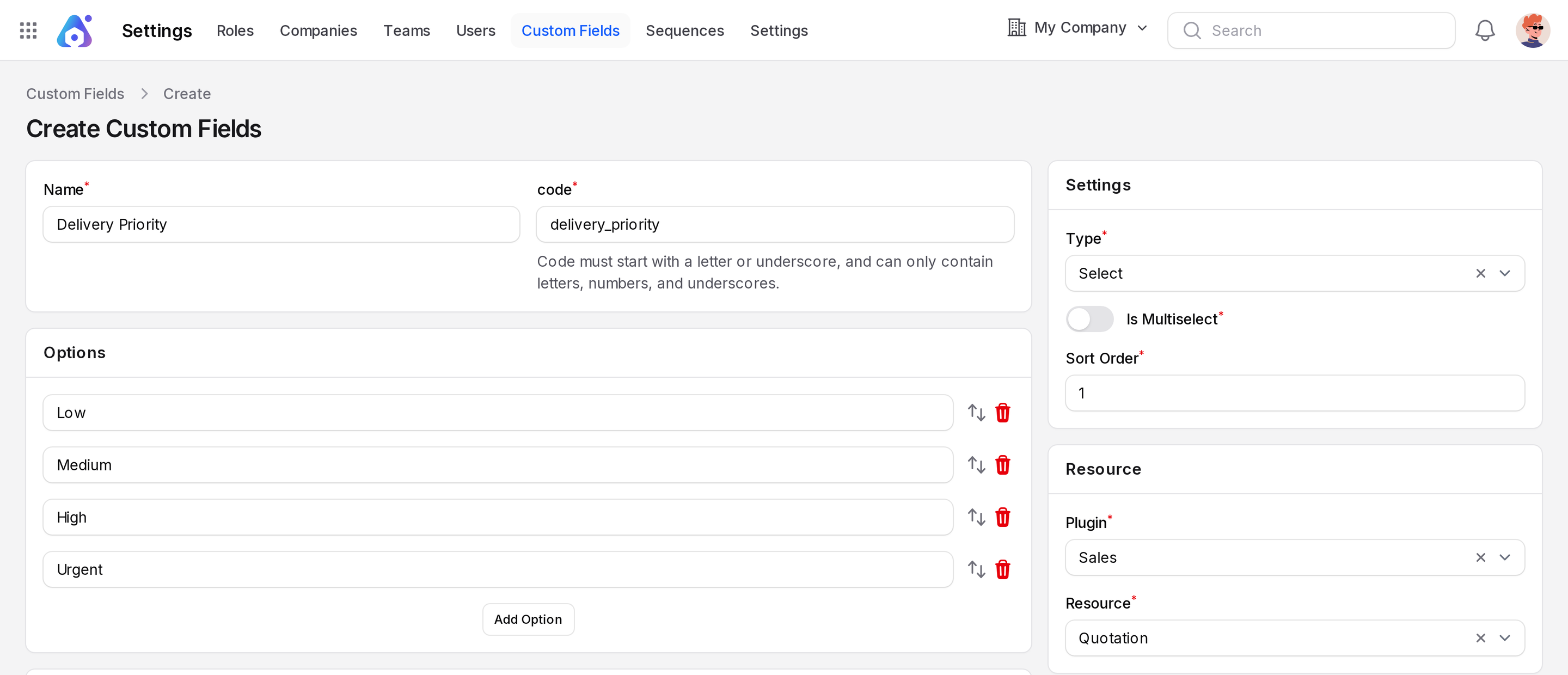
- Fill in the form. The left side holds the field details. The right side holds the type and the target form.
- Click Create.
General
- Name: The label of the field. This is required.
- code: The technical name of the field. This is required and must be unique.
The code must start with a letter or an underscore. It can contain only letters, numbers and underscores. The code also cannot match an existing column of the target form.
Settings
- Type: Choose the kind of input. This is required.
- Input Type: Shown only for Text Input. Choose Text, Email, Numeric, Integer, Password, Telephone, URL or Color.
- Is Multiselect: Shown only for Select. Turn it on to let users pick more than one value.
- Sort Order: A whole number. It sets the position of the field among the other custom fields.

WARNING
After you save, you cannot change Code, Type, Input Type, Plugin or Resource. Choose them with care.
Resource
Choose where the field appears.
- Plugin: Choose the app that owns the form. This is required.
- Resource: Choose the form. It appears after you choose a plugin. This is required.
Only forms that support custom fields are listed. Forms of plugins that are not installed or not active are left out.

Options
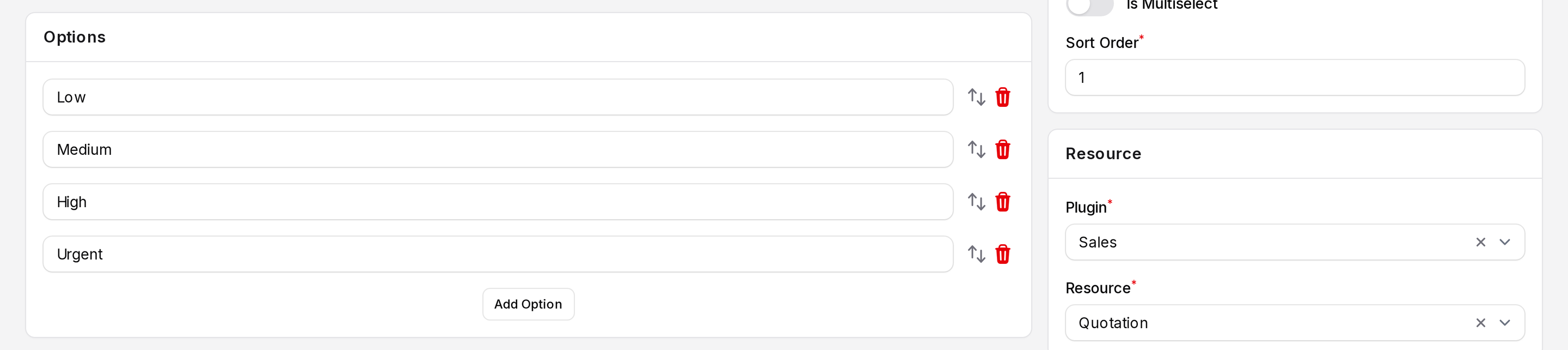
This section appears only for the types Select, Checkbox List and Radio. Click Add Option for each choice, and type its name.
Form Settings
Use this section to control how the field behaves on the form. It has two parts.
Validations set rules for the value. Click Add Validation, then fill in:
- Validation: Choose a rule, for example Required or Max Length. The list depends on the field type.
- Field: Shown only for rules that compare with another field.
- Value: Shown only for rules that need a value, for example a number or a text.
Additional Settings change the look and help text. Click Add Setting, then fill in:
- Setting: Choose an option, for example Default Value, Placeholder, Helper Text, Hint or Read Only. The list depends on the field type.
- Value: Enter the value for that setting. Some settings show a Color list instead.
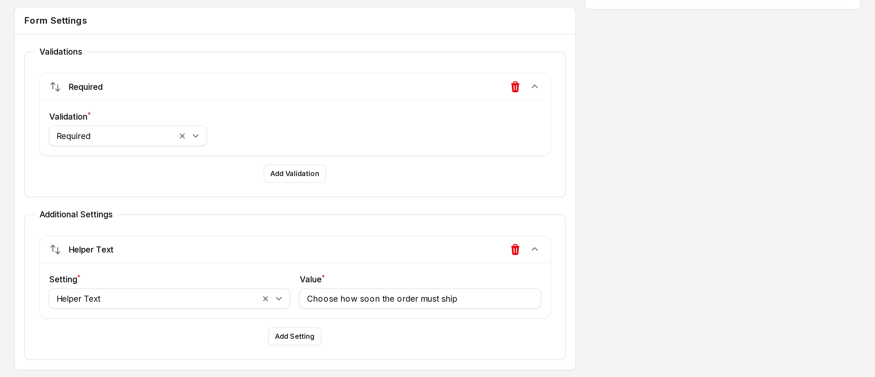
Table Settings
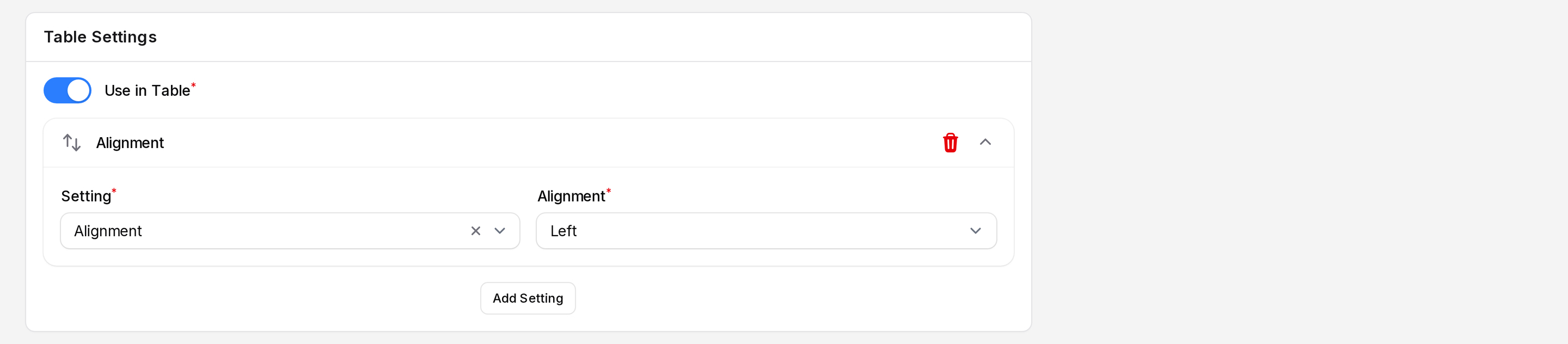
Use this section to show the field as a column in the list of the target form.
- Turn on Use in Table.
- Click Add Setting, if you want to adjust the column.
- Choose a Setting, then set its value. Options include Color, Alignment, Font Weight, Icon Position and Size.
Infolist Settings
Use this section to style the field on the read-only view page of a record. Click Add Setting, choose a Setting, then set its value. Options include Color, Font Weight, Icon Position and Size.

Field types
| Type | Use it for |
|---|---|
| Text Input | A single line of text, an email, a number, a phone or a URL |
| Textarea | A longer text |
| Select | A drop-down list with one or more values |
| Checkbox | A yes or no tick box |
| Radio | One choice from a short list |
| Toggle | A yes or no switch |
| Checkbox List | Several choices from a list |
| Date Time Picker | A date, or a date with time |
| Rich Text Editor | Formatted text |
| Markdown Editor | Text written in Markdown |
| Color Picker | A color |
Where custom fields appear
After you save a field, it shows up in these places on the target form:
- Form: The field appears at the end of the create and edit form.
- List: The field appears as a column, only when Use in Table is on. It is also available in the list filters.
- View page: The field appears on the read-only page of the record, styled by the Infolist Settings.
INFO
Saving a new field adds a column to the database table of the target form. So the field is ready to use at once.
Edit, archive and delete a field
Click the three dots at the end of a row to open the menu.
- Edit: Change the name, options, settings and sort order. You cannot change the locked fields.
- Delete: Move the field to the Archived tab. Records keep their values.
- Restore: Bring an archived field back.
- Force delete: Remove the field for good. This also removes its column from the database table.
You can also select several rows and use the bulk actions for restore, delete and force delete.
WARNING
Force delete cannot be undone. The values stored in that field are lost.